
Simply Wall St Snowflake Explained: How the 5 Scores Actually Work

This post may contain affiliate links. If you sign up through them, we may earn a commission at no cost to you.
Most investors look at the Simply Wall St snowflake for three seconds, see a big green blob, and buy the stock. That's not analysis. That's a mood ring with a brokerage account.
The snowflake is actually one of the better-designed scoring visuals in retail investing. But it only helps you if you know what each of the five points measures, how the 0 to 6 scoring works underneath, and where the model goes quiet on you.
This is the short, practical breakdown. If you want the full 4,000-word teardown with pricing, data accuracy, and our 76/100 Alpha Score, that lives in our Simply Wall St deep dive review.
What the Simply Wall St snowflake actually measures
The Simply Wall St snowflake is a five-sided radar chart. Each point represents one dimension of a company's fundamentals, and each is scored 0 to 6 based on a fixed set of checks. The platform runs this across 120,000+ stocks in 90 markets.
Here are the five axes and the question each one answers:
| Axis | What it scores | The question it answers |
|---|---|---|
| Value | Price vs estimated fair value (DCF-based) | Am I overpaying for this? |
| Future Growth | Analyst forecasts for earnings and revenue | Is this business expected to grow? |
| Past Performance | Historical earnings quality and growth | Has it actually delivered before? |
| Financial Health | Debt levels, balance sheet strength | Can it survive a bad year? |
| Dividends | Yield, stability, and coverage | Is the payout real and sustainable? |
A stock that scores well everywhere fills out into that fat, green, symmetrical shape. A stock that's cheap but drowning in debt looks lopsided. The shape is the point: you can spot the imbalance faster than you can read a 10-K.
How the snowflake scoring works underneath
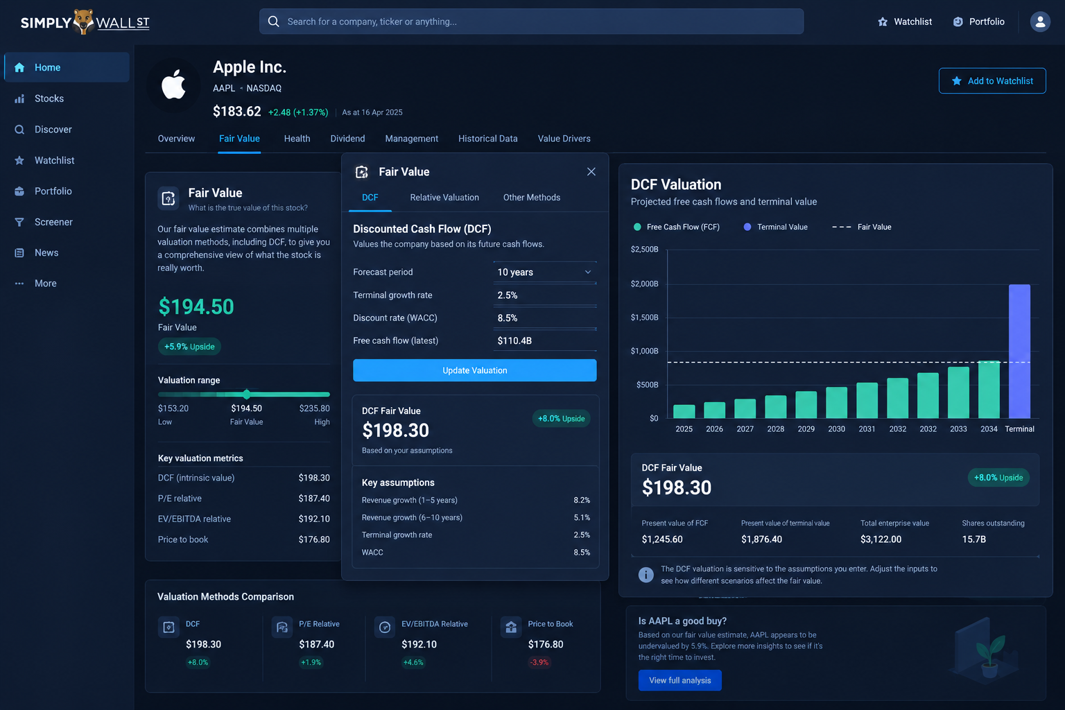
Each axis runs a checklist of pass/fail tests, and the number of passes sets the 0 to 6 score. The Value axis, for example, leans on a discounted cash flow model, and Simply Wall St publishes that DCF methodology openly on GitHub, including what the model does and doesn't account for.
That transparency matters more than it sounds. Most retail scoring tools are black boxes that ask you to trust the output. The Simply Wall St snowflake shows its homework, which is why Transparency is the strongest pillar in our scoring at 18/20.
The written explanations under each factor tell you exactly what was checked and which checks failed. Read those. The blob is the summary; the checklist is the substance.
Where the snowflake is reliable
The snowflake is reliable as a fundamentals filter. It compresses balance sheet health, valuation, growth expectations, and dividend quality into one comparable visual, and it does that consistently across a huge universe of stocks.
That makes it a strong first pass. Screening 40 dividend candidates down to 8 worth researching is exactly the job this tool was built for, and it does that job well.
Where the snowflake breaks
Three honest limits, because a tool you trust blindly is a tool that will eventually cost you money:
No audited track record. Simply Wall St documents its methodology, but it does not publish an independently audited backtest showing how snowflake scores predicted forward returns across market cycles. A high score means the fundamentals check out today, not that the stock will outperform.
Fundamentals lag price. The snowflake updates on filings and estimates. It will not warn you about a news event, a guidance cut, or a sector rotation that's happening this week.
It's built for investors, not traders. If you're timing entries on momentum or options flow, the Simply Wall St snowflake is the wrong instrument. It measures business quality, not price action.
How to actually use the snowflake (the system)
Process beats prediction, so here's the three-step system we'd run:
Step 1: Screen by shape. Use the screener to filter the 120,000+ stock universe by snowflake score, sector, and market cap. You're building a shortlist, not picking a winner.
Step 2: Read the failed checks. For each candidate, open the factor explanations and read what failed. A 4/6 on Financial Health means two specific red flags. Know which two.
Step 3: Verify the fair value. The Value axis rests on DCF assumptions. Check the inputs against your own view before you treat "undervalued" as fact.
Do that and the snowflake becomes what it should be: a filter that saves you hours, feeding a decision you still make yourself.
What it costs to use
The free plan covers 5 full reports a month and one portfolio, which is enough to learn the tool. Premium runs $131.40/year ($10.95/month billed annually) and Unlimited runs $258/year ($21.50/month billed annually). There's a 7-day Premium trial with no card required.
Full plan-by-plan breakdown, data accuracy testing, and the complete 76/100 Alpha Score scoring is in the Simply Wall St deep dive.
Simply Wall St snowflake: quick answers
What is the Simply Wall St snowflake?
A five-axis radar chart that scores every stock 0 to 6 on value, future growth, past performance, financial health, and dividends. The fuller and greener the shape, the stronger the fundamentals profile.
Is the Simply Wall St snowflake accurate?
The methodology is transparent and published, including the DCF model on GitHub. But there's no independently audited backtest tying snowflake scores to forward returns, so treat it as a fundamentals summary, not a prediction.
Can I see snowflake scores for free?
Yes. The free plan includes 5 full company reports per month, and the 7-day Premium trial requires no card.
Is the snowflake useful for day trading?
No. It scores business fundamentals that update on filings and estimates. Traders need price action and flow tools, which is a different category entirely.
We test the tools. You get the verdict.
One email a week. What we tested, what scored, and what we'd skip. Written for traders, not for clicks.
More from FullStack Alpha